The snafu at the Oscars with another movie being announced as a winner before being corrected has created quite a stir!

You can watch the fateful sequence here and the audience reaction captured by the LA Time photographer Al Seib
Watch the moment when “La La Land” is mistakenly announced best picture winner https://t.co/h3WScQsfxB pic.twitter.com/5QzqnwfwRv
— Los Angeles Times (@latimes) February 27, 2017
User Design Thinking
The design of the User Interface is so important – as this article rightly points out: This Simple Design Change Would Have Saved The Oscars

Credit Reddit
https://www.reddit.com/r/Design/comments/5wfs74/another_award_show_cringe_brought_upon_by_bad/
As they point out – the largest thing on the card is the Academy’s logo – not useful information in this context. Simple changes would have made all the difference for the hosts reading the card including large print for the key pieces of data
Electronic Medical Records Design
The same is true for Electronic Medical Records (EMR’s). This has been an ongoing topic of discussion and challenge with the interaction – for example:
2009 Usability of Electronic Medical Records (pdf) – as they describe is a difficult task as crafting a system for the highly tangled tasks in medicine that includes that involves skilled users, complex functionality, and critical tasks is difficult in any form – and even more so from a digital user interface
Obvious problems with EMRs, such as loss of productivity and long training times, have deeper causes. These stem from the complex interaction of highly skilled physicians trying to complete complex tasks in a challenging work environment with a complex and not always usable medical information system. Yet, by applying user-centered design in this complex environment, usability professionals can contribute significantly to improving EMR usability. Greater productivity and lower costs with better health care may yet be our destiny.
Bearing in mind this was written 8 years ago we are still struggling to navigate to the greater productivity and lower costs that were the pot of gold at the end of this particular rainbow.
More recently
2013: Impact of Electronic Health Record Systems on Information Integrity: Quality and Safety Implications
We see the same challenges associated with the EMR design that contribute to suboptimal care and continue to frustrate the clinical team who’s task lists have increased in both volume and elements reducing the available time
Usability errors occur as a result of system complexity, lack of user-friendly functionality (e.g., confusing user interfaces), workflow incompatibility, or limitations of the user. Faulty functionality could mislead clinicians where there is a confusing screen display or when incorrect values result from a programming error that incorrectly converts from one measurement system to another (e.g., pounds to kilograms or Celsius to Fahrenheit). A new kind of error occurring in EHRs that is not an issue with paper-based records is an “adjacency error,” in which a provider selects an item next to the intended one in a drop-down menu, such as the wrong patient or medication.
And as recently as 2016 in Journal of Biomedical Informatics: Navigation in the electronic health record: A review of the safety and usability literature (behind a paywall)
A methodical review of the literature focused on the inefficient navigation of EMR’s that increases user’s cognitive load

Courtesy Pixabay
which may increase potential for errors, reduce efficiency, and increase fatigue.
As they noted, “usability researchers are frequently capturing navigation-related issues even in articles that did not explicitly state navigation as a focus. Capturing and synthesizing the literature on navigation is challenging because of the lack of uniform vocabulary. Navigation is a potential target for normative recommendations for improved interaction design for safer systems.”
For anyone involved in user interface design or dealing with Electronic Medical Records and complex densely populated screens this challenge is clear. The path for healthcare is not as clear as it is for the Oscars
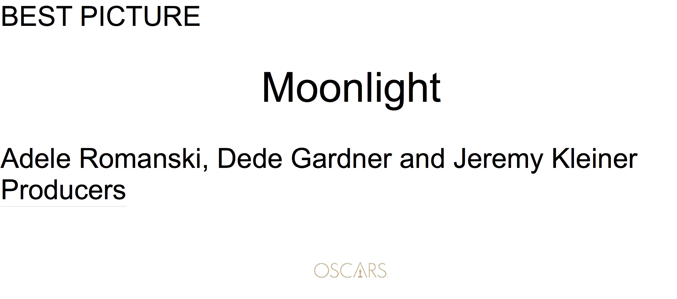
Using a simple San Serif Font – large print for the award category and the name of the winner followed by the people involved with the Oscars logo at the bottom.
User Design Thinking in Healthcare
Healthcare is not that simple – but that should not and does not stop us from learning from other industries to apply user design thinking to everything we do:
- Designing with simplicity and ease of use in mind
- Reducing not increasing cognitive load for clinicians
- Removing or at least suppressing non-essential information from the immediate clinical dashboard
- Capitalizing on existing intuitive multi-input interfaces that are prevalent everywhere else
The user interface remains challenging and requires a new level of focus and attention as we continue to increase the data load and resulting cognitive load on our busy time challenged clinical staff. Let’s not have an Oscar moment in healthcare
If you have ideas on how we can improve and accelerate the user centric design thinking in healthcare – share your thoughts below or reach out to me on any of my channels


Comments are closed.